Chase Pay
Client
JPMorgan Chase
Roles
UX strategy & design
Design manager
Art direction
Visual design
Research
Take a look
Chase Pay is the bank's foray into the digital payments space. Customers have their existing Chase cards loaded into the digital wallet, and with the mobile app, they can pay at merchants, pay at the pump, order food, and get rewards.
Saving customers time and money with the app while still offering the security they expect from Chase was our top priority. Which is why, as Head of Design for Chase Pay, I pushed our team put customer needs first in our designs—making sure we validated the features and experiences with actual customers in user testing.
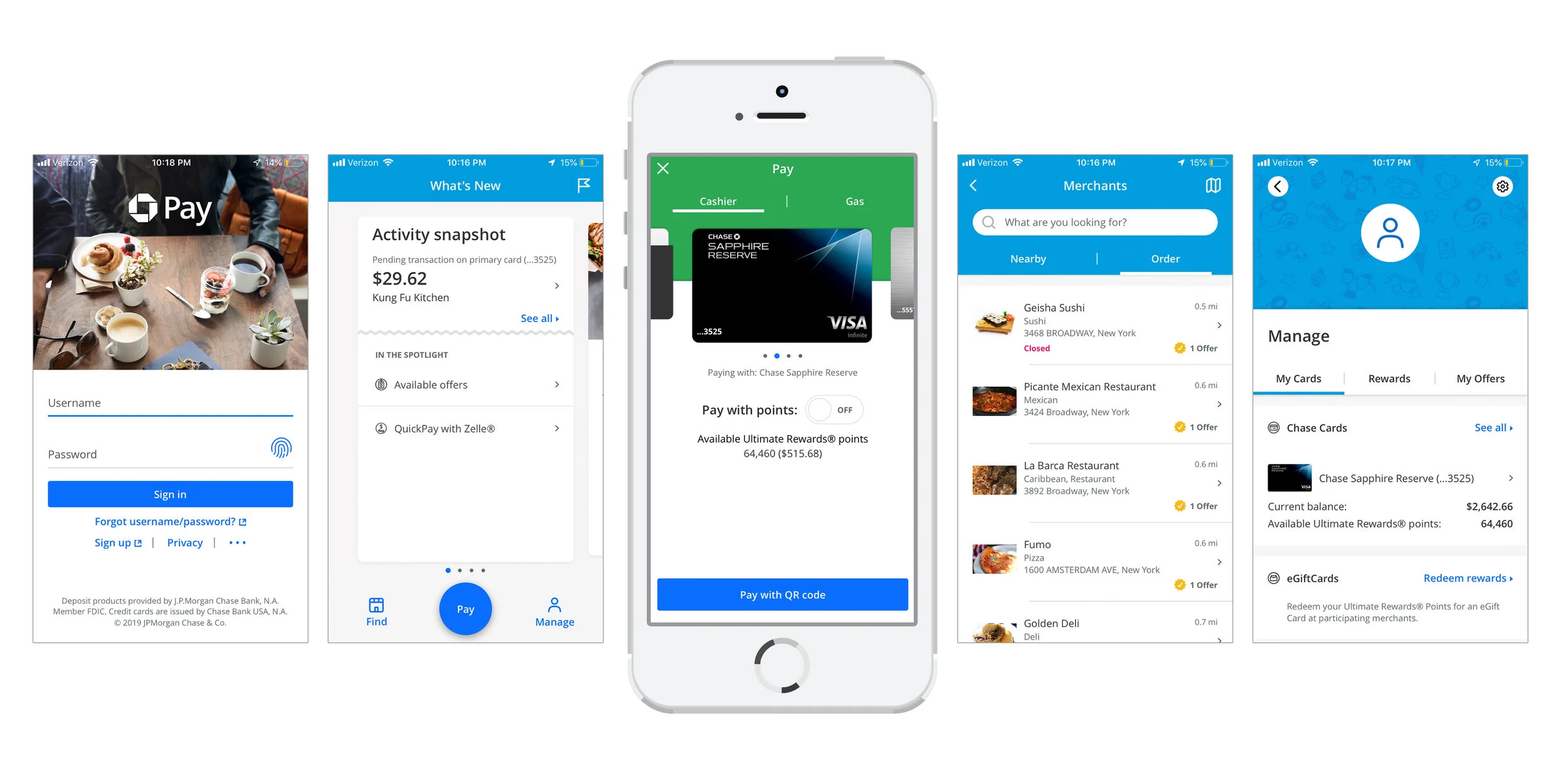
We launched a redesign of the app with our 2.0 release that included a new visual identity, a new navigation, a more focused and personalized homescreen experience, and brand new features and enhancements.
↑ Selection of 2.0 screens from the app, after the redesign. From left to right, 1) Sign-in, 2) Homescreen, 3) Pay with QR code, 4) Merchants nearby, 5) Manage account
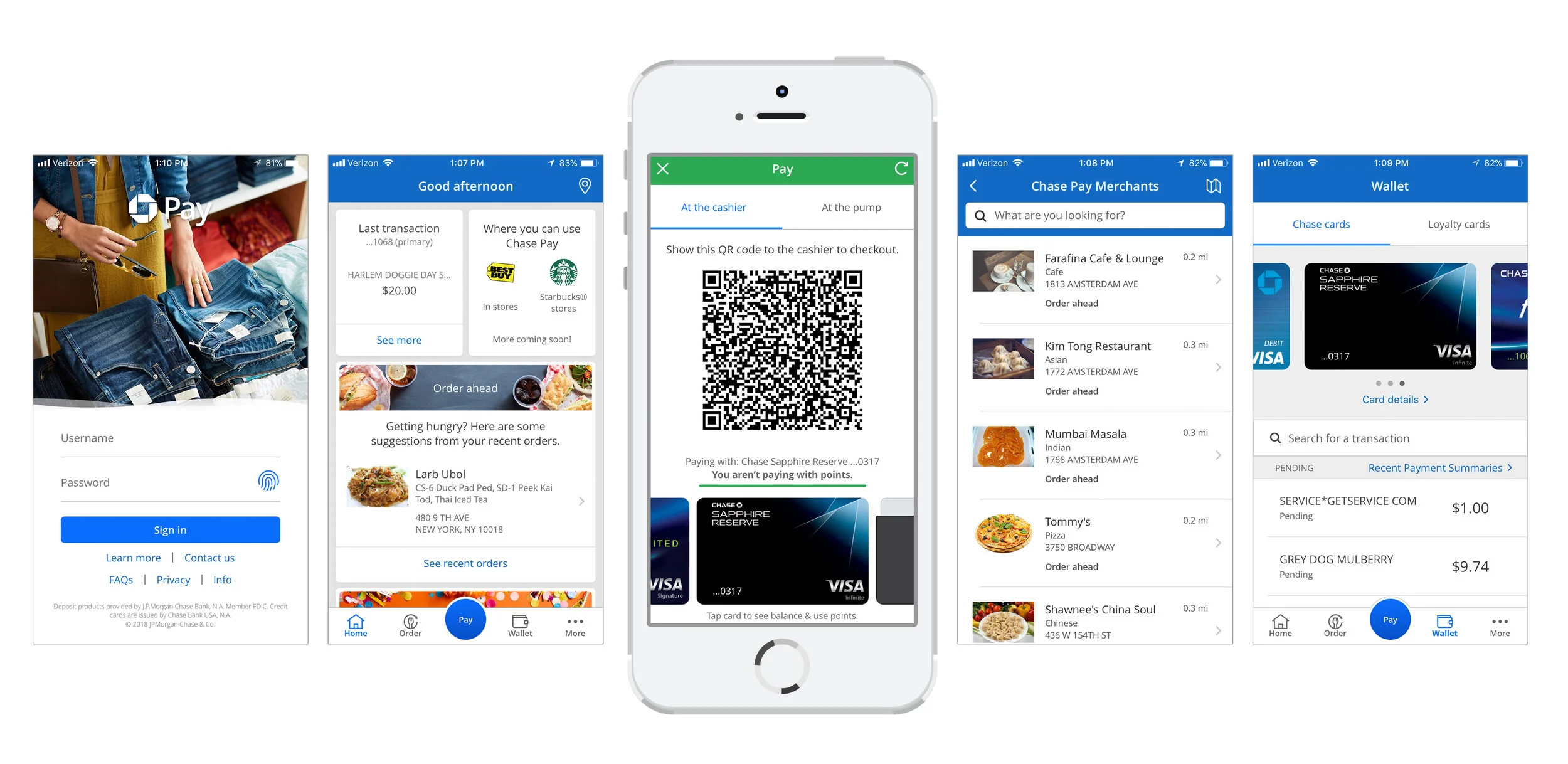
↑ Selection of 1.0 screens from the app, before the redesign. From left to right, 1) Sign-in, 2) Homescreen, 3) Pay with QR code, 4) Merchants nearby, 5) Wallet with transactions


